
Introduction: Why Moodboard Overlays Are Everywhere
Scroll through Instagram, Pinterest, or TikTok for 30 seconds and you’ll see it: layered images, ripped-paper textures, film frames, and scribbles that make a simple photo look like an editorial spread. That’s the power of a moodboard overlay.
For creators, brands, and designers, a moodboard overlay is one of the fastest ways to:
- Give posts a cohesive “aesthetic”
- Communicate a vibe or concept in seconds
- Make average photos look intentionally designed
This guide breaks down exactly what a moodboard overlay is, how to use it (even if you’re not a designer), and how to turn it into a repeatable system for your content and brand.
Core Concept / “The What”: What Is a Moodboard Overlay?
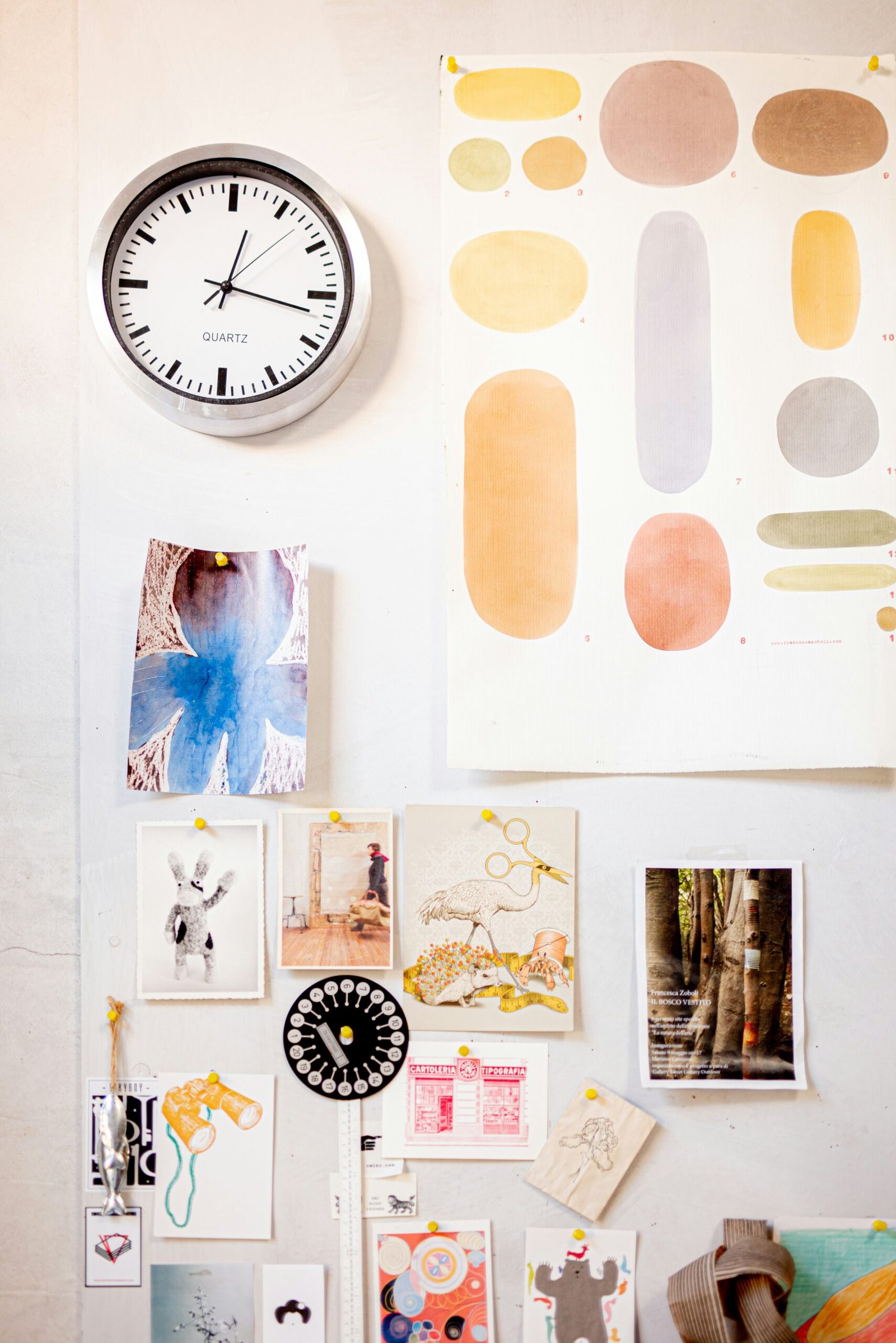
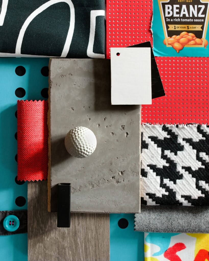
A moodboard overlay is a transparent or semi-transparent graphic layered on top of photos or backgrounds to create the look of a curated mood board.
Instead of manually arranging dozens of elements from scratch, you drop a ready-made overlay on top and get:
- Collage-style layouts
- Grids and frames
- Tape, paper textures, and scribbles
- Text placeholders and accent shapes
Common types of moodboard overlays:
- Grid overlays
Polaroid-style frames, film strips, or simple boxes dividing your canvas into multiple slots. - Texture overlays
Paper grain, crumpled paper, film dust, grain, shadows, and torn edges. - Branding overlays
Logos, taglines, or repeated phrases placed subtly behind or on top of imagery. - Aesthetic overlays
Doodles, tape, stickers, pins, washi tape, and handwritten notes.
Where creators use moodboard overlays:
- Instagram Stories & Reels covers
- Pinterest pins
- Brand presentations & client pitches
- Digital products (ebooks, lookbooks, Notion covers)
- Website hero images or blog post graphics
Think of a moodboard overlay as a shortcut to “this looks like a designer touched it”—without starting from a blank canvas every time.
Time & Investment: What You Actually Need
You can start using moodboard overlays with very little time and budget.
Time Investment
Once you’ve done a quick setup:
- Single post / Story: 5–10 minutes
- Full carousel of 3–5 slides: 15–30 minutes
- Brand kit of reusable templates: 1–2 hours (one-time setup)
Money Investment
You have several options:
- Free moodboard overlay PNGs & templates
- Found on design marketplaces, free resource sites, or within Canva/Adobe Express.
- Great for testing what style fits your brand.
- Paid overlay packs or template bundles ($5–$40)
- Cohesive sets in multiple sizes (Stories, Reels, Pinterest, posts).
- Ideal once you know your aesthetic: minimal, vintage, bold, editorial, etc.
- Custom design from a freelancer or agency
- Best for brands wanting a proprietary look.
- Higher upfront cost, but reusable across campaigns and platforms.
If you’re a solo creator or small business, a single moodboard overlay pack can cover months of content.
Step-by-Step / “The How”: Using a Moodboard Overlay in Your Workflow
Below is a tool-agnostic process you can apply in Canva, Photoshop, Procreate, or mobile apps like PicsArt.
Step 1: Define the Mood & Purpose
Before you even pick an overlay, ask:
- What am I trying to communicate?
- Cozy? Luxury? Minimal? Y2K? Editorial?
- What is this graphic for?
- Story, Reel cover, Pinterest pin, sales page, client presentation?
This helps you choose a moodboard overlay that reinforces your message (e.g., clean grids for a luxury brand, ripped paper for a casual lifestyle feel).
Step 2: Choose or Import Your Overlay
Open your design tool:
- In Canva / Adobe Express
- Search for “moodboard overlay,” “photo collage,” “aesthetic grid,” or “torn paper” in Elements or Templates.
- Or upload your own PNG overlays.
- In Photoshop / Procreate
- Import overlay PNGs on a new layer.
- Set blend modes (e.g., Multiply, Screen, Overlay) for textures.
Keep a folder on your device named something like moodboard_overlays so you can quickly reuse favorites.
Step 3: Place Your Images Behind the Overlay
Typical workflow:
- Drag your photos into the document.
- Position them under the overlay layer.
- Resize and crop so important details show through frames/windows.
If your overlay has distinct “frames”:
- Use 3–6 images max to avoid a cluttered look.
- Mix:
- Wide shots
- Details/close-ups
- Maybe one text-only block
Step 4: Adjust Colors & Cohesion
To make the moodboard feel intentional:
- Apply a consistent filter or LUT across all photos.
- Slightly lower saturation or add a subtle tint that matches your brand palette.
- Use the overlay color to tie everything together (e.g., warm beige for neutral brands, deep charcoal for high-contrast mood boards).
Step 5: Add Text, Logos & Final Touches
Keep text minimal and legible:
- One main headline (e.g., “Brand Mood,” “Fall Campaign,” “New Collection”).
- Optional subhead or short descriptor.
- Your logo or handle in a consistent corner.
Then:
- Export at high resolution for where you’ll use it (e.g., 1080×1920 for Stories, 1000×1500+ for Pinterest).
- Save a template version so you can quickly swap photos next time.
Key Benefits & Strategic Impact
Using a moodboard overlay consistently can:
- Increase perceived quality
Your posts look like magazine layouts, not random photo dumps. - Reinforce brand identity
Repeated frames, colors, and textures become visual “signatures” your audience recognizes. - Speed up content creation
The layout decisions are already made. You’re just swapping in new visuals and text. - Help clients & teams visualize direction
For designers, marketers, and photographers, moodboard overlays make it easier to sell a concept or campaign.
Many creators see higher saves and shares on moodboard-style posts because they function as inspiration boards their followers want to revisit.
Optimization & Pro-Tips for Moodboard Overlays
1. Build a Mini Overlay Stack
Create a small “stack” of 3–5 overlays that work together:
- One simple grid
- One torn-paper layout
- One heavy-texture background
- One minimal, single-image frame
- One text-focused slide
Use this stack across:
- Story sequences
- Reels intros/outros
- Launch campaigns
- Email headers
This gives you variety with consistency.
2. Match Overlay Style to Content Type
- Educational / carousels: Clean grids, light textures, generous margins.
- Lifestyle / behind the scenes: Ripped edges, taped corners, scribbles.
- Luxury / high-end: Minimal overlays, thin lines, subtle grain.
3. Use Overlays for A/B Testing
Test two versions of the same content:
- Plain photo vs. moodboard overlay version.
- Track:
- Click-through from Stories
- Saves on Instagram
- Repins on Pinterest
Keep using the formats that outperform for your audience.
4. Create SEO-Friendly Visual Assets
For blog posts and landing pages:
- Name files descriptively (e.g.,
moodboard-overlay-brand-identity.png). - Add alt text referencing:
- “moodboard overlay”
- “brand mood board layout”
- “aesthetic collage for Instagram”
Implementation & Best Practices
For Creators & Influencers
- Turn one photoshoot into:
- A full moodboard carousel
- Matching Story covers
- Pinterest graphics
using the same overlay pack.
- Use overlays to tease drops or launches:
- Blur or partially reveal products behind frames.
- Add phrases like “Coming Soon” or “Drop 03”.
For Brands & Agencies
- Create a branded moodboard overlay kit for your team:
- Logo lockups
- On-brand color overlays
- Grid templates
- Standardize:
- Story highlight covers
- Reel covers
- Case study graphics
This keeps your brand cohesive across multiple designers and channels.
Common Mistakes to Avoid
When working with a moodboard overlay, watch out for:
- Overloading with too many photos
If every frame is full and busy, nothing stands out. Leave some negative space. - Tiny, unreadable text
Aesthetic doesn’t matter if people can’t read the words. Test on your phone before posting. - Clashing styles
Vintage film overlay + neon Y2K stickers + ultra-minimal serif text can feel chaotic. Stick to a defined aesthetic. - Ignoring mobile optimization
Most viewers are on their phones. Design at mobile sizes first and zoom out frequently to check readability.
Maintenance & Long-Term Strategy
- Create a “Content System,” not one-off designs
Save a set of templates in your design tool with:- Locked overlay layers
- Editable photo + text layers
- Batch-create assets
Once a month, make:- 5–10 moodboard-style Stories
- 3–5 Pinterest pins
- 2–3 carousel posts
using the same overlay kit.
- Refresh overlays seasonally
Keep your structure the same but tweak:- Colors (e.g., warm tones for fall, pastels for spring)
- Textures (paper in winter, film grain in summer campaigns)
- Back up your overlay library
Store your PNGs, PSDs, or Canva templates in cloud folders so you never lose the system you’ve built.
Conclusion
A moodboard overlay is one of the highest-impact, lowest-effort tools you can add to your content workflow. With a few well-chosen overlays and a simple system, you can:
- Make your posts look professionally designed
- Communicate mood and brand identity at a glance
- Save time every time you sit down to create
If you’re ready to experiment, start with:
- One overlay pack that matches your aesthetic.
- One Canva or Photoshop template you can reuse.
- One test post or Story sequence this week.
Watch how your content feels—and how your audience responds. Then refine and build your own recognizable moodboard overlay style over time.