You don’t need a $10,000 agency retainer to look like you belong in the market. You need clarity.
That’s the secret nobody tells you. The brands that feel expensive — the ones you trust immediately, the ones that linger in your mind — aren’t necessarily backed by big budgets. They’re backed by decisions. Consistent, intentional, ruthless decisions about who they are and how they show up.
If you’re a solo founder, a freelancer, or a small team watching every dollar, this guide is for you. We’re going to walk through exactly how to build a brand identity that looks and feels professional — even if your budget is closer to $50 than $5,000.
Let’s get into it.
What Brand Identity Actually Means (And What It Doesn’t)
Before we spend a single dollar, let’s clear something up.
Brand identity is not your logo. Your logo is one small piece of a much larger puzzle. Brand identity is the entire system — the visual language, the tone of voice, the emotional experience someone has every time they encounter your business.
Think of it this way: your logo is your face. Your brand identity is your personality, your wardrobe, the way you shake hands, and the stories you tell at dinner.
Brand identity includes:
- Your logo and logo variations
- Color palette
- Typography (fonts)
- Imagery style and photography direction
- Brand voice and messaging tone
- Graphic elements (patterns, icons, textures)
- The overall feeling someone gets from your presence
When all of these elements work together, people start to recognize you without even reading your name. That’s the goal.
Step 1: Define Your Brand Foundation Before You Design Anything
This is the step most people skip — and it’s why most DIY brands look scattered.
Before you open Canva or browse fonts, answer these questions on paper:
Who are you serving?
Get specific. “Women aged 25-45” is not specific. “First-time moms returning to work who feel overwhelmed by the transition” is specific. The tighter your audience, the easier every design decision becomes.
What problem do you solve?
Not your product — the feeling behind it. A skincare brand doesn’t solve dry skin. It solves the discomfort of looking in the mirror and not recognizing yourself. A productivity app doesn’t manage tasks. It gives people back the feeling of control.
What do you want people to feel?
This is the most important brand question you’ll ever answer. Write down three to five emotions. Maybe it’s: calm, confident, warm. Or: bold, energized, trustworthy. These feelings become your design compass.
If your brand were a person, who would they be?
Are they the friend who always knows the best coffee shop? The mentor who speaks softly but carries authority? The rebel who challenges the status quo? Write a short character description. It will save you hundreds of dollars in design revisions later.
Once you have this foundation, every visual and verbal choice becomes easier. You’re no longer guessing — you’re deciding.
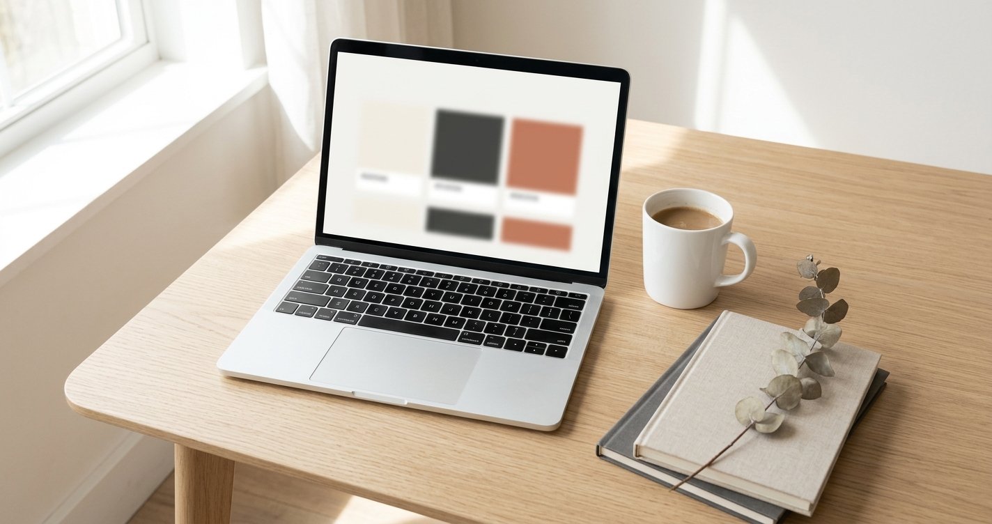
Step 2: Build a Color Palette That Does the Work for You
Color is the fastest communicator in your brand toolkit. People make subconscious judgments about a brand within 90 seconds — and up to 90% of that assessment is based on color alone, according to research from the Seoul International Color Expo.
You don’t need to be a color theorist. You need a system.
The 60-30-10 Rule
Professional designers use this ratio constantly, and it works at any budget:
- 60% — Primary (dominant) color. This is your background, your whitespace, your canvas. For most brands, this is a neutral: white, off-white, cream, warm grey, or deep charcoal.
- 30% — Secondary color. This supports your primary. It might appear in section backgrounds, large text blocks, or key graphics. Choose something that complements without competing.
- 10% — Accent color. This is your attention-grabber. Buttons, highlights, small pops of contrast. Make it sharp and intentional.
Budget-Friendly Tools for Color
- Coolors.co — Free palette generator. Lock one color you love and let the tool build around it.
- Adobe Color — Free. Explore trending palettes or extract colors from a photograph you admire.
- Real-world inspiration — Pull colors from nature, architecture, or a magazine editorial that matches the feeling you defined in Step 1.
One Pro Tip
Choose your neutral wisely. Pure white (#FFFFFF) on pure black (#000000) can feel clinical or harsh. Slightly warm whites like #F8F6F3 or soft charcoals like #2C2C2C add depth and sophistication for free.
Step 3: Choose Typography That Speaks Before You Do
Fonts carry personality. A rounded, friendly sans-serif tells a completely different story than a sharp, high-contrast serif. And here’s the good news: you don’t need to buy fonts.
Google Fonts offers hundreds of professional-quality typefaces at zero cost.
The Two-Font Rule
Limit yourself to two fonts — one for headings, one for body text. This constraint isn’t a limitation; it’s a discipline that forces cohesion.
Pairing strategies that work:
| Heading Font | Body Font | Vibe |
|---|---|---|
| Cormorant Garamond | Source Serif 4 | Editorial, refined, literary |
| Bebas Neue | DM Mono | Bold, modern, tech-forward |
| Syne | Lora | Creative, warm, approachable |
| Playfair Display | Crimson Pro | Luxury, classic, elegant |
| Instrument Serif | DM Sans | Contemporary, minimal, smart |
Avoid These Common Mistakes
- Never use more than three fonts. Two is ideal; three is your absolute ceiling.
- Never default to system fonts. Arial, Helvetica, and Times New Roman scream “I didn’t try.”
- Never use decorative fonts for body text. Save the script and display fonts for logos or large hero headlines only.
- Always establish a type scale. Decide on your H1, H2, body, and caption sizes and stick to them everywhere.
Step 4: Create a Logo Without Hiring a Designer
Let’s be honest — a great logo can cost thousands. But a good logo? One that’s clean, memorable, and professional? You can absolutely create one yourself if you follow some guardrails.
What Makes a Logo Work on a Small Budget
Simplicity wins. The most iconic logos in the world — Apple, Nike, Airbnb — are geometrically simple. Your logo should be recognizable at 32 pixels (favicon size) and on a billboard.
Start with your name in a strong typeface. A well-set wordmark (just your brand name in a carefully chosen font) is often more effective than a complex icon. Think of brands like Glossier, Allbirds, or Casper — all started with clean wordmarks.
Avoid the DIY trap of over-designing. No clip art. No five-element icons. No gradients that won’t reproduce well in black and white.
Free and Low-Cost Tools
- Canva (Free tier) — Good for wordmarks and simple layouts. Use their font pairing suggestions as a starting point.
- Figma (Free tier) — More control than Canva. Better for geometric shapes and precise spacing.
- Looka or Hatchful — AI-assisted logo generators. Use them for inspiration, then refine in Figma or Canva.
- Google Fonts — Find a distinctive font for your wordmark and export it.
Create Logo Variations
A professional brand needs at least three logo versions:
- Primary logo — Full name, horizontal layout.
- Stacked version — Full name, vertical layout (for square social profiles).
- Icon or monogram — A simplified mark for favicons, app icons, or watermarking.
Make sure all versions work in full color, single color (black), and reversed (white on dark).
Step 5: Define Your Imagery Style

You don’t need a custom photoshoot. But you do need consistency.
Decide on your imagery direction early:
- Photography style: Bright and airy? Dark and moody? Warm and textured? High contrast?
- Subject matter: People in candid moments? Product-only flat lays? Nature and abstract textures?
- Filter and editing: Will you use a consistent preset or filter? Even a subtle warmth shift across all images builds recognition.
Free Image Sources That Don’t Look Stock
- Unsplash — High-quality editorial and lifestyle photography.
- Pexels — Good variety; slightly more casual.
- Burst by Shopify — Ecommerce-focused, free to use.
- Museum open-access collections — For abstract textures, art-inspired backgrounds, or unique visuals.
One Simple Trick
Download 15-20 images that match your brand feeling and save them in a dedicated folder. Whenever you need visual content, pull from that folder only. This one habit will make your Instagram, website, and presentations feel like they came from a cohesive brand — because they did.
Step 6: Develop Your Brand Voice
Your brand voice is what you say. Your tone is how you say it. And both cost nothing to get right.
Write a Brand Voice Chart
Create a simple four-quadrant chart:
| We Are | We Are Not |
|---|---|
| Warm and conversational | Corporate or stiff |
| Confident but humble | Arrogant or preachy |
| Clear and direct | Vague or overly clever |
| Encouraging | Judgmental or patronizing |
Print this. Tape it next to your screen. Before you write an Instagram caption, an email, or a product description, glance at it.
Consistency Over Cleverness
The brands people trust are the ones that sound like the same person, every time. Whether someone is reading your FAQ page or your Instagram bio, the tone should feel familiar.
If you write your own copy (most small brands do), read everything out loud before publishing. If it doesn’t sound like something you’d say to a friend over coffee, revise it.
Step 7: Assemble Your Brand Guide (Even a Simple One)
A brand guide is a single document — even a one-page PDF — that holds all your brand decisions in one place. It ensures consistency and saves you from reinventing the wheel every time you create something.
Your Minimum Viable Brand Guide
Include:
- Logo and all variations — with clear space rules and minimum sizes.
- Color palette — with hex codes, RGB, and CMYK values.
- Typography — font names, sizes, and usage rules.
- Voice and tone — your brand voice chart and sample phrases.
- Imagery examples — 3-5 sample photos that represent your style.
Tools to Build It
- Canva — Create a beautifully designed PDF brand guide using their templates.
- Notion — Build a living brand guide that your whole team can access and update.
- Figma — Design a polished guide with embedded fonts, colors, and components.
Even if you’re a team of one, building this document forces you to make decisions — and decisions are what separate professional brands from amateur ones.
The Real Cost of Building a Brand on a Budget
Let’s talk numbers.
| Item | Budget Option | Cost |
|---|---|---|
| Color palette | Coolors / Adobe Color | Free |
| Typography | Google Fonts | Free |
| Logo | Canva / Figma | Free |
| Stock imagery | Unsplash / Pexels | Free |
| Brand guide | Canva / Notion | Free |
| Domain name | Namecheap / Porkbun | $8–15/year |
| Basic website | Carrd / Notion + Super | $9–19/year |
Total: Under $50 for a complete, professional brand identity.
Compare that to the $3,000-$15,000 most agencies charge for the same deliverables. The difference isn’t quality — it’s process. You’re doing the strategic thinking yourself. The tools are just as capable.
Common Mistakes That Make Cheap Brands Look Cheap
Let’s address the pitfalls directly:
Changing your colors every month. Pick a palette and commit. Constant tweaking signals uncertainty to your audience.
Using different fonts on every platform. Your website, social media, and email signature should all use the same typography system.
Ignoring mobile. Test your logo, colors, and layouts on a phone screen. That’s where most people will see you first.
Copying competitors too closely. Inspiration is fine. Cloning is not. If your brand looks like a discount version of another brand, you’ve already lost.
Skipping the strategy and jumping to design. We said it at the top, and it’s worth repeating: clarity comes first. A beautiful brand with no strategy behind it is just decoration.
Final Thought: Constraints Breed Creativity
Some of the most memorable brands in history were born from limitations. When you can’t throw money at a problem, you’re forced to think deeper. You make more intentional choices. You edit more ruthlessly.
That discipline? It’s actually an advantage.
The brands that feel timeless aren’t the ones with the biggest budgets. They’re the ones with the clearest vision — the founders who knew exactly who they were serving, what they stood for, and how they wanted people to feel.
You can have that clarity today. Start with Step 1. Answer those four questions honestly. Everything else will follow.
Your budget is tiny. Your brand doesn’t have to be.